
Vanilla Extract While building a design system with Vanilla Extract, I noticed that applying design tokens using sprinkles was repetitive. Each time, css.ts file had to be created, and Tailwind I wondered if applying styles based on props, like Tailwind, would be more efficient.
In this process, I started thinking about a highly extensible way to pass styles as props, and while looking for patterns in various UI libraries to solve this problem, Polymorphic 컴포넌트I discovered an interesting concept called.
Box By utilizing the component, as I was able to render various HTML elements via the prop while also passing design tokens as props based on sprinkles.
Through this, I believed I could apply Vanilla Extract's design tokens more flexibly and type-safely.
In fact, Headless UI libraries like the following were already utilizing Polymorphic components.
So, Polymorphic what exactly is a component?
What is a Polymorphic Component?
Polymorphic means having multiple forms.
In React, a Polymorphic component refers to a component that can be rendered as different HTML elements or components depending on the props it receives.
In other words, it can be seen as the most abstracted form of a component that can transform into any other component.
<Box as="h1">제목</Box>
<Box as="p">문단</Box>
<Box as="button">버튼</Box>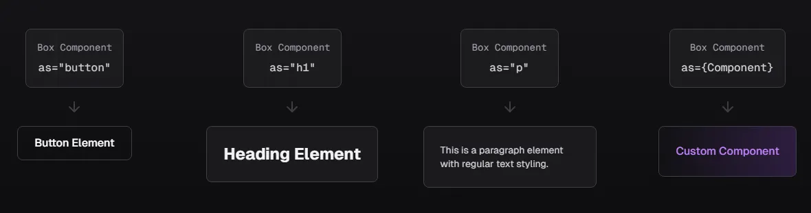
✔ Expressing various elements with a single component
→ <h1>, <p>, <button> and other elements can be reused with the same style
✔ Minimize unnecessary code repetition
→ No need to write the same styles redundantly in multiple places, managed with a consistent component
✔ Flexible style extension
→ Maintain a semantic HTML structure while applying styles according to the design system
Basic Polymorphic Component
The simplest Polymorphic component changes elements by utilizing the as prop.
const Box = <C extends ElementType = 'div'>({ as, ...props }: { as?: C }) => {
  const Component = as || 'div';
  return <Component {...props} />;
};

<Box as="button" onClick={() => alert('클릭!')}>버튼</Box>
This method is simple, but lacks type safety.
Box as="button" should support onClick when used, but it's not guaranteed by the current type system.
To solve this, Polymorphic types must be defined.
Implementing Polymorphic Types
To implement type-safe Polymorphic types, the following factors must be considered.
asprop should correctly change the HTML element.- It must also support the default properties of that element.
- e.g.,
buttonshould allowonClickwhen used
- e.g.,
refmust function correctly.asEven if the prop changes,refshould be correctly connected to the element
- In TypeScript,
asshould only allow attributes that match the prop.
Importing Base Types
First, import the necessary React types.
import type {
  ComponentPropsWithRef,
  ComponentPropsWithoutRef,
  ElementType,
  PropsWithChildren,
} from 'react';
Let's look at why these types are needed:
ElementType: Represents HTML tag or React component typesComponentPropsWithRef: Props type of a component, including refComponentPropsWithoutRef: Props type of a component, excluding refPropsWithChildren: Type including the children prop
Defining PolymorphicRef Type
First, define the ref type.
export type PolymorphicRef<C extends ElementType> = ComponentPropsWithRef<C>['ref'];// 버튼의 ref 타입
type ButtonRef = PolymorphicRef<'button'>;
// div의 ref 타입
type DivRef = PolymorphicRef<'div'>;
// 실제 사용
const buttonRef: ButtonRef = useRef<HTMLButtonElement>(null);This type is necessary to extract the ref type of any HTML element.
Defining AsProp Type
Next, define the type of the as prop.
export type AsProp<C extends ElementType> = {
  as?: C;
};
as prop is optional and restricted to only accept HTML element or React component types.
Through this as props type, HTML elements can be changed. It's a simple but important type.
Usage Example
// 버튼으로 변환 가능한 prop 타입
type ButtonAsProp = AsProp<'button'>;
// { as?: 'button' }

// 실제 컴포넌트에서
const Component = ({ as: Tag = 'div' }: AsProp<'div' | 'button'>) => {
  return <Tag>내용</Tag>;
};
Defining PropsToOmit Utility Type
Create a utility type to remove duplicate prop keys in a component.
Keys of props to omit
export type PropsToOmit<C extends ElementType, P> = keyof (AsProp<C> & P);Usage Example
// 1. HTML 버튼이 기본적으로 가지고 있는 props
interface HTMLButtonProps {
  onClick: (e: MouseEvent) => void;
  className: string;
  type: 'submit' | 'button' | 'reset';
  disabled?: boolean;
  // ... 기타 props
}

// 2. 우리가 만들고 싶은 커스텀 버튼 props
type CustomButtonProps = {
  variant: 'primary' | 'secondary';  // 새로운 prop
  onClick: () => void;              // ⚠️ HTML 버튼과 중복
  className: string;                // ⚠️ HTML 버튼과 중복
}
type ButtonPropsToOmit = PropsToOmit<'button', CustomButtonProps>;
// 결과: "as" | "onClick" | "className" | "variant"In other words, PropsToOmit is a type that tells us which props to exclude from an HTML button and use our own.
PolymorphicComponentProp
Now, using PropsToOmit and AsProp, we create PolymorphicComponentProp.
Create the props type for a basic polymorphic component without ref.
export type PolymorphicComponentProp<
  C extends ElementType,
  Props = Record<string, unknown>
> = PropsWithChildren<Props & AsProp<C>> &
  Omit<ComponentPropsWithoutRef<C>, PropsToOmit<C, Props>>;
PropsWithChildren<Props & AsProp<C>>:childrenandasprop including propsOmit<ComponentPropsWithoutRef<C>, PropsToOmit<C, Props>>: Remove duplicate props
- Combine custom props and as prop
- Add children prop
- Remove duplicates from HTML element's default props
type CustomButtonProps = {
  variant: 'primary' | 'secondary';
};
type ButtonComponentProps = PolymorphicComponentProp<'button', CustomButtonProps>;
PolymorphicComponentPropWithRef
Add the ref prop to the base PolymorphicComponentProp type.
export type PolymorphicComponentPropWithRef<
  C extends ElementType,
  Props = Record<string, unknown>
> = PolymorphicComponentProp<C, Props> & { ref?: PolymorphicRef<C> };
Now, it becomes the final type that supports ref.
Full Code
import type {
	ComponentPropsWithRef,
	ComponentPropsWithoutRef,
	ElementType,
	PropsWithChildren,
} from 'react';

/**
 * Polymorphic component의 ref 타입을 정의
 * @template C - 컴포넌트의 기본 HTML 엘리먼트 타입
 */
export type PolymorphicRef<C extends ElementType> =
	ComponentPropsWithRef<C>['ref'];

/**
 * 'as' prop의 타입을 정의
 * @template C - 변환하고자 하는 엘리먼트 타입
 */
export type AsProp<C extends ElementType> = {
	as?: C;
};

/**
 * 중복되는 prop 키들을 제거하기 위한 유틸리티 타입
 * @template C - 컴포넌트의 기본 HTML 엘리먼트 타입
 * @template P - 컴포넌트의 추가 props 타입
 */
export type PropsToOmit<C extends ElementType, P> = keyof (AsProp<C> & P);

/**
 * ref가 없는 Polymorphic 컴포넌트의 props 타입
 * @template C - 컴포넌트의 기본 HTML 엘리먼트 타입
 * @template Props - 컴포넌트의 추가 props 타입
 */
export type PolymorphicComponentProp<
	C extends ElementType,
	Props = Record<string, unknown>,
> = PropsWithChildren<Props & AsProp<C>> &
	Omit<ComponentPropsWithoutRef<C>, PropsToOmit<C, Props>>;

/**
 * ref를 포함한 Polymorphic 컴포넌트의 props 타입
 * @template C - 컴포넌트의 기본 HTML 엘리먼트 타입
 * @template Props - 컴포넌트의 추가 props 타입
 */
export type PolymorphicComponentPropWithRef<
	C extends ElementType,
	Props = Record<string, unknown>,
> = PolymorphicComponentProp<C, Props> & { ref?: PolymorphicRef<C> };
Final Box Component Implementation
Now that all types are ready, we can create a Polymorphic Box component as an example.
import { PolymorphicComponentPropWithRef, PolymorphicRef } from './types'

const Box = forwardRef(<C extends ElementType = 'div'>(
  props: PolymorphicComponentPropWithRef<C, { color?: string } accelerators
  ref?: PolymorphicRef<C>
) => {
  const { as: Component = 'div', color, children, ...rest } = props;

  return (
    <Component
      ref={ref}
      style={{ color }}
      {...rest}
    >
      {children}
    </Component>
  );
});
This implementation allows us to create a type-safe and highly reusable Box Polymorphic component.
// 사용
<Box>기본 텍스트</Box>
<Box as="h1" color="red">빨간 제목</Box>
<Box as="button" onClick={() => alert('클릭!')}>버튼</Box>
Now that we've created the Box component, let's try using Vanilla Extract's design tokens as props, similar to Tailwind.
Extending Styles by Combining with Vanilla Extract
To combine Polymorphic components with Vanilla Extract, I referred to the method proposed by Sandro Roth.
The operating principle is as follows:
- When the
Boxcomponent receivesprops extractAtomsseparates style-relatedpropssprinklesgenerates CSS classes corresponding to thoseprops- The generated classes are applied to the component
This way, while maintaining Vanilla Extract's type safety, styles can be applied intuitively, like Tailwind.
Configuring Sprinkles
First, I created a sprinkles file. Although more tokens were needed in reality, I only wrote the basic ones for this example.
import { createSprinkles, defineProperties } from '@vanilla-extract/sprinkles';

const responsiveProperties = defineProperties({
  conditions: {
    mobile: {},
    tablet: { '@media': 'screen and (min-width: 768px)' },
    desktop: { '@media': 'screen and (min-width: 1024px)' },
  },
  defaultCondition: 'mobile',
  properties: {
    display: ['none', 'flex', 'block', 'inline'],
    flexDirection: ['row', 'column'],
    padding: {
      none: '0',
      small: '8px',
      medium: '16px',
      large: '24px',
    },
    margin: {
      none: '0',
      small: '8px',
      medium: '16px',
      large: '24px',
    },
  },
  shorthands: {
    p: ['padding'],
    m: ['margin'],
  }
});

const baseProperties = defineProperties({
  properties: {
    cursor: ['default', 'pointer'],
    borderRadius: {
      none: '0',
      small: '4px',
      medium: '8px',
      large: '16px',
    }
  }
});

// 3. Sprinkles 함수 생성
export const sprinkles = createSprinkles(
  responsiveProperties,
  baseProperties
);

// 4. 타입 추출
export type Sprinkles = Parameters<typeof sprinkles>[0];
Separating style props with extractAtoms
Create an atoms.ts file to define utility functions that can utilize Sprinkles.
const keys = Array.from(sprinkles.properties.keys());
export const extractAtoms = <P extends object>(props: P) => [
	pick(props, keys),
	omit(props, keys),
];
sprinkles.properties.keys()
- Retrieves all style property keys defined in sprinkles.
- In the example code,
['display', 'flexDirection', 'padding', 'margin', 'cursor', 'borderRadius']can be retrieved.
extractAtoms function
- Separates component props into style props and general props, returning them as a tuple.
- Uses generics to handle props of any type.
Create the generateClassNames function.
function generateClassNames(atoms: Atoms) {
  const { reset, className, ...rest } = atoms;
  const sprinklesClassNames = sprinkles(rest);
  return clsx(
    sprinklesClassNames,
    className,
    reset ? [elementResets[reset]] : null,
  );
}reset: Key to reset the default styles of an HTML element (e.g., 'button', 'input')className: Custom class directly passed by the userrest: Remaining style properties (properties to be handled by sprinkles)
const sprinklesClassNames = sprinkles(rest) generates atomic classes.
Combining classes with clsx
return clsx(
  sprinklesClassNames,        // sprinkles로 생성된 클래스들
  className,                  // 사용자 정의 클래스
  reset ? [elementResets[reset]] : null  // 리셋 클래스 (있는 경우)
);
generateClassNames({
  reset: 'button',
  className: 'custom-button',
  padding: 'medium',
  margin: 'large'
});
// 결과: 'sprinkles_padding_medium sprinkles_margin_large custom-button button-reset'
atoms function
export function atoms(atoms: Atoms) {
  return generateClassNames(atoms);
}
- Hides the internal implementation (
generateClassNames) and provides a simple public API. Encapsulation - Generates class names while ensuring type safety.
Full Code
import { elementResets, sprinkles } from '../styles';

import clsx from 'clsx';
import omit from 'lodash/omit';
import pick from 'lodash/pick';
import type { Atoms } from '../types/atoms';

const keys = Array.from(sprinkles.properties.keys());
export const extractAtoms = <P extends object>(props: P) => [
	pick(props, keys),
	omit(props, keys),
];

function generateClassNames(atoms: Atoms) {
	const { reset, className, ...rest } = atoms;
	const sprinklesClassNames = sprinkles(rest);
	return clsx(
		sprinklesClassNames,
		className,
		reset ? [elementResets[reset]] : null,
	);
}

export function atoms(atoms: Atoms) {
	return generateClassNames(atoms);
}
Applying Sprinkles to the Box Component
Now, let's introduce it in a polymorphic component.
import {
	type ElementType,
	type HTMLAttributes,
	type ReactNode,
	forwardRef,
} from 'react';
import type { Atoms } from './atoms';
import type { PolymorphicComponentPropWithRef } from './types/polymorhpic';
import { atoms, extractAtoms } from './utils/atoms';

type HTMLProperties = Omit<
	HTMLAttributes<HTMLElement>,
	'className' | 'color' | 'height' | 'width' | 'size'
>;

export type BoxProps<C extends ElementType = 'div'> =
	PolymorphicComponentPropWithRef<C, HTMLProperties & Atoms>;

type BoxComponent = <C extends ElementType = 'div'>(
	props: BoxProps<C>,
) => ReactNode;

export const Box: BoxComponent = forwardRef<HTMLElement, BoxProps<ElementType>>(
	({ as, ...restProps }, ref) => {
		const [atomsProps, propsToForward] = extractAtoms(restProps);
		const Component: ElementType = as || 'div';
		const className = atoms({
			className: propsToForward?.className,
			reset: typeof Component === 'string' ? Component : 'div',
			...atomsProps,
		});

		return <Component {...propsToForward} className={className} ref={ref} />;
	},
);
Let's examine the code piece by piece:
type HTMLProperties = Omit<
  HTMLAttributes<HTMLElement>,
  'className' | 'color' | 'height' | 'width' | 'size'
>;
Exclude attributes that may conflict with Atoms from HTML base properties
Box Props Type Definition
export type BoxProps<C extends ElementType = 'div'> =
  PolymorphicComponentPropWithRef<C, HTMLProperties & Atoms>;
- Combine HTML attributes and Atoms attributes
- Includes ref type
Managing the Type System
Here, I encountered the first challenge. If the type system is not properly managed, props auto-completion doesn't work.
It was especially important to explicitly define the BoxComponent type.
If the type of BoxComponent is not specified, auto-completion for props will not work.
// 1. BoxComponent 타입 정의
type BoxComponent = <C extends ElementType = 'div'>(
  props: BoxProps<C>,
) => ReactNode;

// 2. Box 컴포넌트에 타입 어노테이션 적용
export const Box: BoxComponent = forwardRef(
  <C extends ElementType = 'div'>(
    { as, ...restProps }: BoxProps<C>,
    ref?: PolymorphicRef<C>
  ) => {
    // ... 구현
  }
);
This way, generic types can be preserved.
// BoxComponent 타입이 없다면:
const Box = forwardRef(...)
// ⚠️ 제네릭이 특정 타입으로 고정됨
// props의 타입 추론이 제대로 되지 않음

// BoxComponent 타입이 있으면:
const Box: BoxComponent = forwardRef(...)
// ✅ 제네릭 타입이 보존됨
// props의 타입이 정확하게 추론됨
Sprinkles Props Type Inference
// BoxComponent 타입이 없을 때:
<Box
  padding={} // ⚠️ 자동완성 동작 안함
  margin={} // ⚠️ 가능한 값 추론 안됨
/>

// BoxComponent 타입이 있을 때:
<Box
  padding="medium" // ✅ 자동완성으로 가능한 값 표시
  margin={['small', 'medium']} // ✅ 반응형 값도 정확히 추론
/>
as prop type inference
// BoxComponent 타입이 있을 때의 정확한 타입 추론:
<Box as="button" onClick={() => {}} /> // ✅ button의 props 정확히 추론
<Box as="a" href="/home" /> // ✅ a 태그의 props 정확히 추론
<Box as={CustomComponent} customProp="" /> // ✅ 커스텀 컴포넌트 props 추론
// ✅ 모든 props 타입이 정확하게 추론됨
<Box
  as="button"
  padding="medium"
  margin={['small', 'medium']}
  display={{ mobile: 'block', desktop: 'flex' }}
  onClick={(e: React.MouseEvent) => {}}
>
  버튼
</Box>

// ✅ 커스텀 컴포넌트 props도 정확하게 추론
interface CustomProps {
  custom: string;
}
const Custom = ({ custom }: CustomProps) => <div>{custom}</div>;

<Box
  as={Custom}
  custom="value" // ✅ CustomProps 타입 체크
  padding="medium"
>
  커스텀
</Box>
The type of BoxComponent must be explicitly defined for type inference like the following to work.
- Generic type preservation
- Sprinkles props type inference
- Accurate props type inference based on as prop
- Improve DX (autocomplete, type checking)
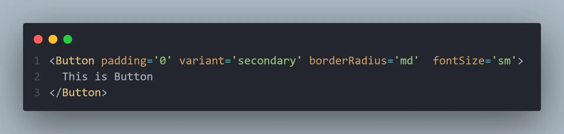
Extending Button Component using Box
import { type ButtonHTMLAttributes, type ReactNode, forwardRef } from 'react';
import ClipLoader from 'react-spinners/ClipLoader';
import { Box } from '..';
import type { AtomProps } from './types/atoms';
import * as styles from './Button.css';

// 1. Button 전용 Props 타입 정의
export interface ButtonProps
	extends Omit<ButtonHTMLAttributes<HTMLButtonElement>, 'prefix' | 'color'>,
		AtomProps {
	variant?: 'primary' | 'secondary' | 'ghost' | 'outline';
	size?: 'sm' | 'md' | 'lg' | 'zero';
	selected?: boolean;
	prefix?: ReactNode;
	suffix?: ReactNode;
	loading?: boolean;
}

// 2. Button 컴포넌트 구현
export const Button = forwardRef<HTMLButtonElement, ButtonProps>(
	(
		{
			variant = 'primary',
			size = 'md',
			selected = false,
			disabled = false,
			prefix,
			suffix,
			loading = false,
			children,
			...restProps
		},
		ref,
	) => {
		return (
			<Box // Box를 button 엘리먼트로 변경
				as='button'
				className={styles.button({
					variant,
					size,
					disabled,
					loading,
					selected,
				})}
				disabled={disabled || loading}
				aria-pressed={selected}
				aria-busy={loading}
				ref={ref}
				{...restProps}
			>
				{loading && <ClipLoader color={'#0142C0'} size={14} role='status' />}
				{prefix && prefix}
				{children}
				{suffix && suffix}
			</Box>
		);
	},
);
The Button component implemented this way:
Box's style props can all be used as-isButton's unique features (loading, prefix/suffix, etc.) have been added- Maintains perfect type safety
- ARIA attributes are also handled automatically
Conclusion
Changes after application
Adopting the Polymorphic component pattern brought about several positive changes.
- The first thing I noticed was improved developer experience.The code became much more intuitive, and thanks to TypeScript's powerful type system, stability was also ensured. In particular, the reusability of components increased, allowing us to leverage existing code extensively when adding new features.
- From a design system perspective,there were also significant advantages. Design tokens could be used consistently, and Box components could be easily added based on the Box component. Most importantly, style extension became flexible, allowing for quick responses to design change requests.
- As a result, overall productivity significantly improved.Repetitive coding was reduced, and component development time was shortened. Moreover, easier maintenance proved to be of greater value in the long run.
Remaining Challenges
Of course, there is still much room for improvement. Going forward, I plan to focus on the following areas:
- Enhance accessibility (a11y): Aim to provide a better user experience by automating ARIA attributes and improving keyboard interaction
- Performance optimization: Will improve bundle size and rendering performance to ensure faster loading speeds
- Documentation improvement: Plan to integrate Storybook and write detailed usage guides to increase team adoption
- Strengthen testing: Will expand unit and E2E tests to further enhance stability
Implementing Polymorphic components was not easy, but I learned a lot from it. In particular, I realized the importance of in-depth TypeScript usage and component design.
Initially, I started with the simple idea of wanting to use Vanilla Extract as conveniently as Tailwind. As a result, I discovered greater value. This pattern was particularly useful in building the design system. Component reusability increased, and development productivity significantly improved.
I hope this experience can be of some help to developers facing similar challenges. The journey to create a better design system will continue.
References